It is difficult for many of us to realize the reality of the accelerating global climate change on the planet, and alarming notices seem especially unlikely when there is nice September weather outside. At the same time, I totally understand plenty of messages are spread nowadays in order to frighten people, and whichever way we look there are warnings: attention, beware, danger! – of which we are already so tired. While preparing this material, I would not like to become similar to unconscious conductors of the Animal Mind System who intimidate the population by approaching terrible cataclysms, however, unfortunately, it’s very unwise to underestimate the situation as well.
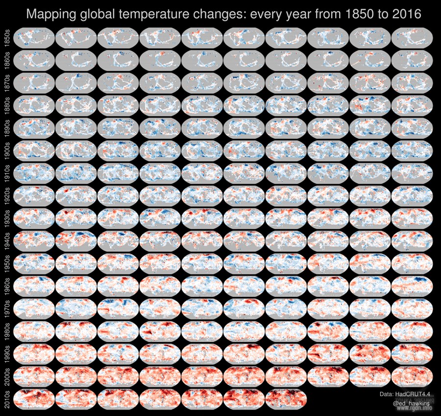
Today I will present convincing evidence that our planet is indeed getting warmer. Ed Hawkins, climatologist from the University of Reading (UK), has created a bewitching visualisation of how global warming is accelerating on the Earth. Using the technique of “small multiples”, he has depicted 167 tiny maps based on meteorological data of the UK Met Office over the period of 1850 through 2016, where yearly temperature anomalies are shown. At first glance, the visualisation looks as a pastel sketch in blue and red shades. An obvious warming trend is noticeable, especially in the last several decades. The lack of data at the early stage of observations (as depicted in grey) is due to a limited number of weather stations before the 20th century. The El Niño active phase start is reflected by a spot in the equatorial part of the Pacific Ocean, which spot dies out later on.

download and view a high-resolution image
“My work is useful for presenting a simple message: the world is getting warmer,” Hawkins says. “That nearly every region has warmed links to people’s everyday experiences in their own location, and makes climate change more relevant on an individual level.”
Prepared by Roman V. (Kiev, Ukraine)
 The planet is getting warmer! Climate change: visualisation, 1850 through 2016
votes:
123
|

Project Aim


Leave comment